Selling a film to audiences is an art – sometimes literally, as those of us who’ve been sucked in by a striking cover at the video store will attest. We scoured the globe to come up with some examples of international markets taking their own tack in selling some Kiwi classics – or not-so-classics – to their nation’s eager movie-watchers.
Bad Taste
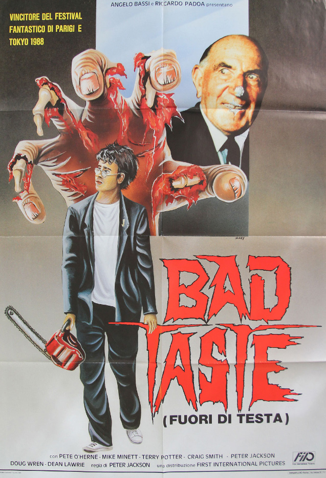
It’s a brave move indeed to discard the iconic image of a scowling alien giving the camera the finger, indeed Italians may have been very surprised to find this was a sci-fi splatter. Perhaps the chainsaw gives it away, we’re mostly surprised to see that the upcoming Guns Akimbo may not have be Daniel Radcliffe’s first starring role in Aotearoa. Squint and you’ll swear that’s Harry Potter in a rumpled school uniform leaning on a logo straight off a school exercise book…
Braindead
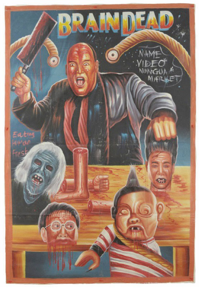
The movie posters of Ghana are a delight to behold, but rather than sniggering at how they’ve gotten a famous movie star’s face horribly wrong, with Braindead we love how the film’s undergone a subtle shift. For some reason, creepy Uncle Les is now the main character (admittedly this has happened once before when Josh Thomson read the part at a Flicks live script read and stole scenes with sexually ambiguous sleaziness). The dismemberment is a bit tidier than memory serves, too, and there are some perspective issues in the pic, but man, that baby is almost creepier than in Jackson’s film.
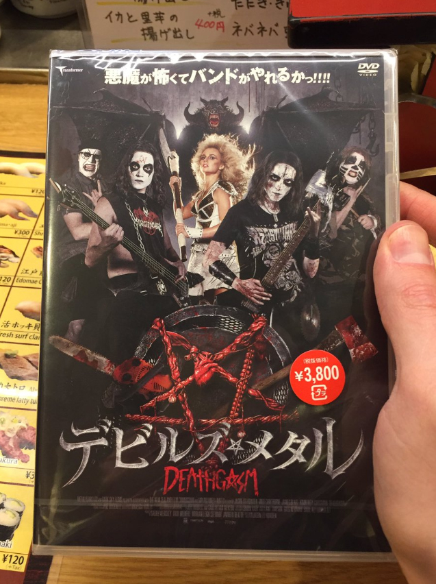
Deathgasm
In the US you can buy guns at Walmart, but not a film with “gasm” in the title. The film’s death-by-dildo, copious gore and foul language are all fine because of an innocuous title, right? While the strong NZ artwork can be seen in plenty of places worldwide, thankfully Japan upped the ante a bit to balance the scales, as seen in the following pic from director Jason Lei Howden’s Twitter account.
The Devil Dared Me To
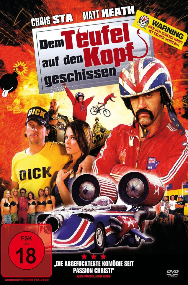
I think this title translates to Shit on the Head of the Devil?! With a quote from a 3-star review proclaiming the film to be “the most fucked up comedy since [The?] Passion [of the?] Christ” accompanying a solid image collage to sell the pic, it seems perfectly pitched at a certain type of audience. Now if they’d only spelled the star’s surname correctly!
Eagle vs Shark
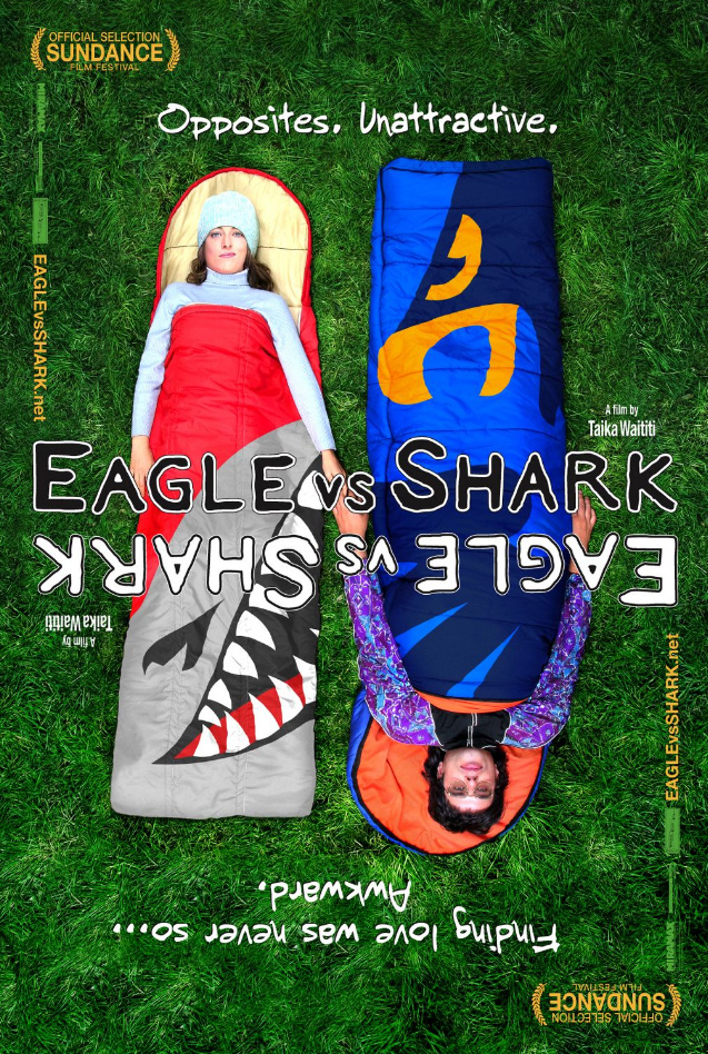
You’ll have to excuse the main characters being badly photoshopped on an awkward grassy texture (though it may have inspired this Boyhood poster). What’s fun about this poster is that you can flip it around or fold it in half and it still works. Kinda like a reversible DVD cover sleeve. Or, more appropriately, a rorschach test.
Meet the Feebles
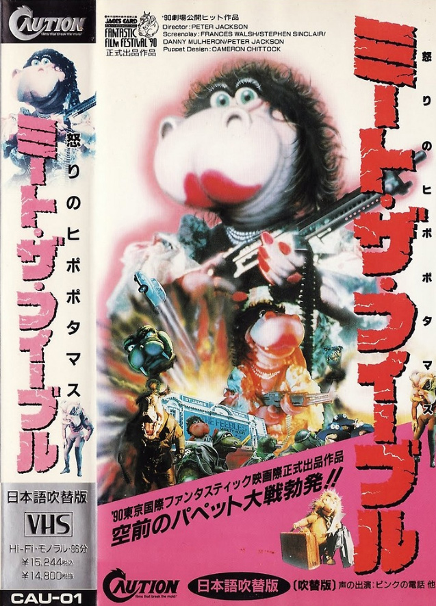
God bless Japanese box art. Subtlty be damned: this cover crams in an explosion, a severed head blasting off like a rocket ship, and TWO images of Heidi the Hippo holding a shotgun. Who needs rhyme or reason when you’ve got beautiful chaos?
The Navigator
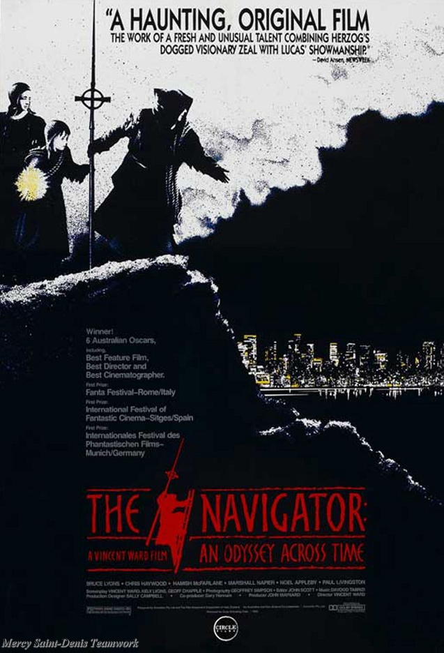
Leading with a quote that puts director Vincent Ward in great company; capturing some of the striking visual feel of his film with a trio of adventurers atop a mountain; and somehow even managing to sell the film’s concept in one image when one’s eye hits the cityscape below, this poster intrigues even before it twists a moviegoer’s arm by boasting about Australian Oscars. Bleak and arresting, like the film it promotes, this poster screams “classic”.
Never Say Die
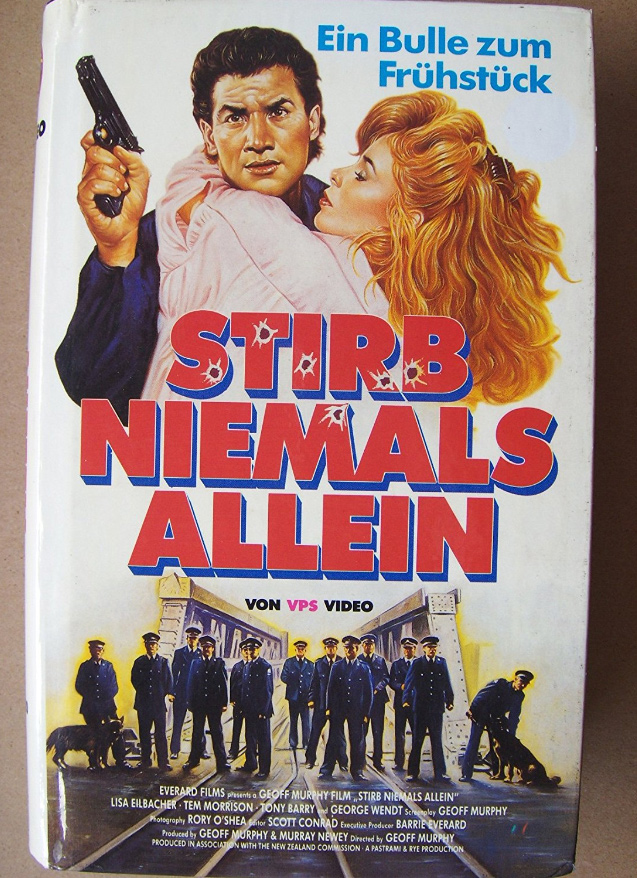
Temuera Morrison is a beautiful-looking man. Somehow, through the magic of VHS box artistry, the illustrator behind this German cover for the ’80s action flick made our national treasure look even more magnificent. That confident gaze, that dominant hairline, them business eyebrows… it’s the type of portrait that belongs on the $100 bill.
Once Were Warriors
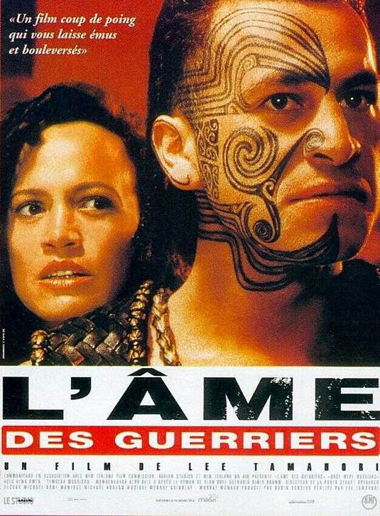
Though there is a significant lack of Tem, the image in this French poster for one of New Zealand’s most confronting dramas does a decent job conveying the film’s pride and tension to international audiences. So it’s accidentally hilarious that, to an ignorant speaker of only English, the word ‘LAME’ seemingly slaps you in the face. It’s actually ‘l’âme’, and the whole title transfers to something closer to The Soul of Warriors.
The Piano
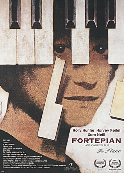
This Polish poster for Jane Campion’s Cannes winner deserves its own Palme d’Or for symbolically matching the film’s theme. The “snapping” of the key, Holly Hunter’s sight becoming clear, her uncertain smile, and the top-down shadow that seemingly looks to engulf her. It’s a brilliant piece of illustration that does justice to our cinematic classic.
Scarfies
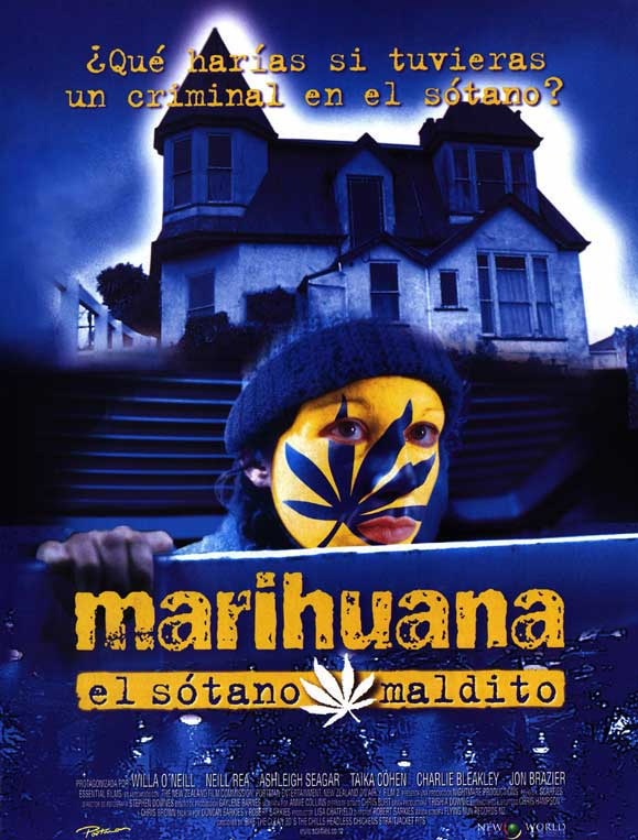
“What would you do if you had a criminal in the basement?” this poster asks – solving it in a one-word title that smokes the bush, rather than beat around it. If NZ had followed the same path, would we now be referring to a film called Dak? One thing’s for sure – expect to see this title remarketed in the near future with Taika Cohen Waititi’s mug all over it.
Shaker Run
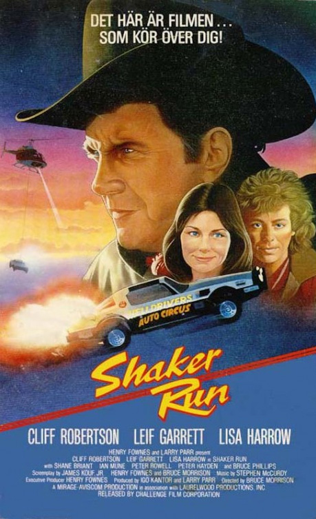
The Danes are generally pretty brave artistically, but apparently not brave enough to correctly depict the film’s true star – its rad car – in its true colour of pink. I guess 1980s Wellington was too frightening to illustrate too, despite being the backdrop to some cool inner city car stunts (more on that here).
Utu
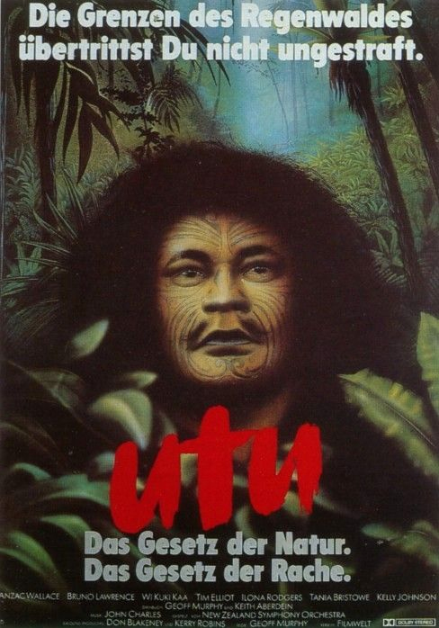
This may be the most peaceful visual interpretation of Geoff Murphy’s tragic New Zealand Land Wars revenge drama ever committed to anything flat.
This story is part of our month-long celebration of 40 years of NZ film. Follow all our daily coverage here.