Movies are illusions from start to finish. Everyone (we hope) knows this. Even documentaries present a perspective on reality, not reality in of itself. Movies are, at best, reality augmented and filtered through the pores of perspective and then reconstructed on the scaffolding of artistic interpretation. Time, place, performance, sound, picture, all are nothing more than fabricated mirages carved to resemble reality in an attempt to reflect some aspect of it. One of the things that many people don’t realize is part of the illusion is colour and a film’s control over it. I’m not talking about the use of colour in the wardrobe or a set or as a design aesthetic, I’m talking about how colour that is photographed is then bent to the will of the filmmaker and their needs.
How this is achieved is through a process known, within the industry, as ‘colour correction’ or ‘colour grading’. Essentially a ‘Photoshop for film’, colour-grading is the manipulation of colour values in an image to achieve a certain look, feel or style that helps accentuate the emotional and visual content of a movie. Usually misunderstood and often unacknowledged, grading is one of the most vital components of modern filmmaking. Here-in, we take a short stroll through the basics of the artform.
So let’s get one thing straight: I’m not a colourist (i.e. someone who colour corrects film and television for a living). Being a colourist is an important and highly skilled job that involves both having a highly trained eye for detecting differences in colour values, plus understanding the complexities of displays and monitors and how colour decisions affect electrical voltage values in modern TVs, cinema projection systems and (still) the reactive photochemical elements of 35-70mm film. I have colour-corrected many different projects in the past from short films to music videos and some local New Zealand television productions, but I am not an expert by any stretch of the imagination. So, disclaimer for any colourists reading this: I’m likely to get my fair share of things wrong or have opinions on grading aesthetics that are not shared by the professionals. I’m just a blogger, not an expert instructor.
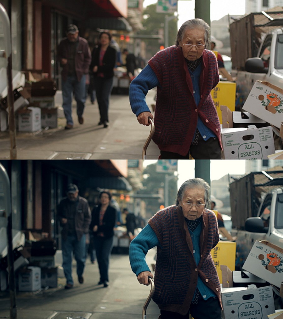
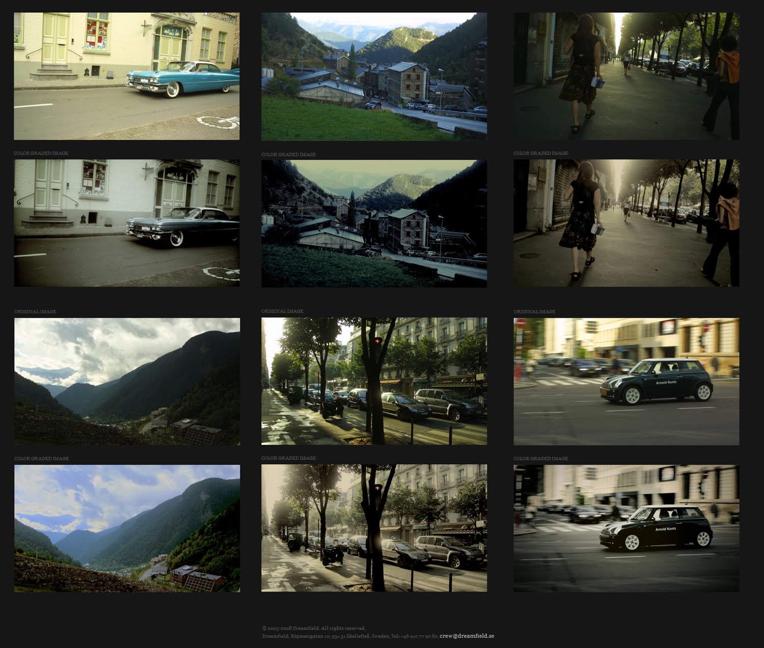
Colour-enhancement of a scene (top: original, bottom: graded image)
Colour-correction started as an off-shoot process of developing and editing film. Filming one scene out of a given movie or television show which, in movie-terms, is supposed to take place over a few minutes actually could take one or two days to complete. As cameras and lights are repositioned and the day wears on, the overall look of the footage changes. This is because, as you’re filming this sequence which supposedly is happening over the course of 60 seconds, the sun is actually moving from morning to afternoon or the film lights have gotten hotter as the day progressed and become warmer or a multitude of technical difficulties can (and usually do) occur that ensure that the shots out of a single single scene can end up looking vastly different. Colour-correction is the process by which all of this footage is brought together and made to look identical to each other as to give the impression that the movie is happening in real-time with no sudden jarring visual problems like a shot being too bright, a scene that’s supposed to be red suddenly becoming purple or a midday-sun suddenly becoming a sunset. This process was originally done photo-chemically through what we refer in the industry as ‘telecine‘ which involves adjusting the colour and gamma values of a film the same way you would adjust the values on your television or computer monitor.
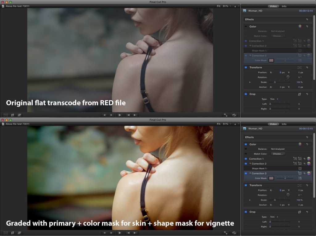
Digital colour enhancement of RED Camera footage.
But since the late 1990’s, when the power of image manipulation via computers experienced a renaissance like nothing seen to date, a gradual shift began to move from photo-chemical telecine to digital color-correction and grading. The advent of such digital tools has also led to greater control over image manipulation and a fantastic new toolset where filmmakers and cinematographers can colour, treat and augment an image to look like almost anything they desire. Rather than simply adjusting the amount of colour, brightness and contrast a shot or scene may have, they can now make the same imagery resemble a misty morning, a starlit night, a warm summer’s day, an animated oil painting, a black and white newspaper comic strip and more. Some of the most atmospheric and jaw-dropping cinematography achieved in the past decade has been through power of digital grading which has, essentially, combined the process of live-action photography with the power of CGI visual effects, but used specifically to augment the way an audience appreciates the style of a movie and how it affects them emotionally.
While digital grading has played a minor role in many films during the end of the last century, such as the 1998 fantasy-comedy Pleasantville where color was not only a major dramatic plot device, but also a huge visual effect achievement, the first movie to be completely digitally graded from start to finish was the Coen Brothers’ musical O Brother, Where Art Thou (2000). In 2001, as filmmakers slowly began to understand the vast potential of colouring their films on a digital platform, a certain bunch of New Zealand filmmakers decided to throw their highly experimental and somewhat madcapped feature film production through the digital grading process as a means to see how far they could push the envelope. Suffice it to say, the process and the film turned out to be rather good:
Today, 99% of films produced in the world are colour-corrected digitally and it’s not difficult to see why. While during the late 90’s only a handful of colour-grading hardware and software was available (FYI: the colour-suite you see used in the above Lord Of The Rings documentary was known as Lustre, developed by Discreet and now owned by Autodesk), in the recent years there has been an explosion in variety of gear available and their power to produce colour realistically without compromising the integrity of the image (unless the colourist purposefully intends to compromise it…more on this later). Even basic NLE suites (Non-Linear-Editing) like AVID, Final Cut and Premiere Pro come with fairly powerful colour-grading tools, as do compositing software like After Effects and Blender.
Of course, this has led to some unforeseen and rather curious side-effects. Colour-correction is a form of almost fine-art with many of its choices in the digital world being made from a position of creativity rather than necessity. In the old days, colour-correction was about “make this shitty footage that doesn’t match look the same!” Today, colour-correction or grading is about “make this shitty footage that doesn’t match look AWESOME!” More emphasis is given to aesthetics, technique and the emotional quality behind the ‘look’ of a film rather than simply fixing the unavoidable day-to-day issues of filmmaking. And thus, like all art forms from sketching, illustration, painting, sculpture and installation, colour-grading has been transformed into a form of creative expression…which in turn has transformed into different ‘schools’ or ‘styles’ of colouring.
You may think you’re lost and that you’re not really sure what I’m talking about. I can assure you that you do. Here are some of the most common digital-grading looks that colourists (and/or filmmakers) love. See how many of them feel familiar or you can spot the next time you’re watching a movie. These looks/styles don’t have official names so I was forced to make up my own (apologies to colourists):
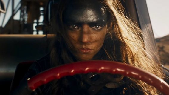
THE ORANGE/TEAL NIGHTMARE
Transformers: Revenge Of The Fallen
As another blogger once expressed: “when will this madness stop?” Often, mistakenly, called the ‘Michael-Bay-look’, this is undoubtedly the single most popular film look in Hollywood right now. A gargantuan amount of films are colour-graded to some assimilation of this horrific aesthetic which can only be described as being ‘awesome once-upon-a-time, but now officially gone guano-loco’. Sometime in near history, some clever-dick colourist realized that if they pushed the midtones towards the orange value and the black-tones towards the teal (light blue) value and upped the contrast and saturation, suddenly everything on the screen popped like a soft-drink commercial and the trademark magic-hour look of LA’s finest sunsets could be achieved no matter the time of day (or night even). Then…everyone started doing it.
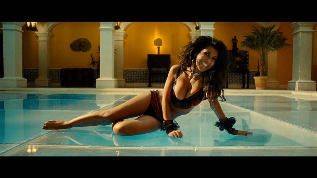
Columbiana (yes this image is from a DIFFERENT movie)
Seriously, this shit’s gotta stop. For one thing, everyone’s skin tone becomes bright orange. For another thing, everyone DOES look like they’re in a soft-drink commercial. But really, the reason why we loathe this look is because its so standardized that it makes it hard to tell films apart and it kinda diminishes the creativity that is possible with colour-grading because this look does make everything look kinda in-your-face and gives stuff a million-dollar-glow. But more than that, we also hate that this look gets applied to films which really don’t need this visual colour aesthetic. Case in point:
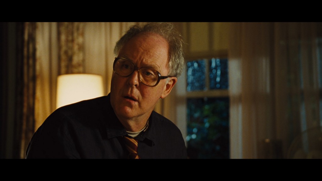
Rise Of The Planet Of The Apes
Poor John Lithgow. He just doesn’t deserve to look like he’s drank too much Fanta in a universe where the moonlight is strange greenish-blue. Science-fiction films shouldn’t look like this unless there’s a point to it and that doesn’t seem to be the case since the look is so standardized. I mean look at this guy’s living room, it’s so brown and filthy. Ew. You’ll see this look in everything – romantic comedies are notoriously bad for this as are most Hollywood action films and blockbusters. I swear it’s taken me days to find examples of films that aren’t coloured with this look! A more cynical mind would suggest this is the studio-executive’s grading look of choice, but whether that’s true or not one thing is for certain: THIS SHIT HAS GOT TO STOP.
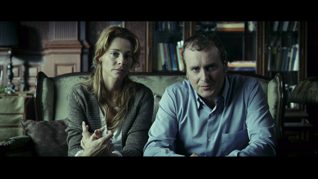
THE DE-SATURATED WORLD
If there is an antithesis to the Orange/Teal Nightmare then this may be it. Because nothing says your movie is SERIOUS than having all the colour sucked out of it like it was assaulted by an undead, garlic-sensitive, Claude Monet. That’s right melon farmer, colour is for pussies.
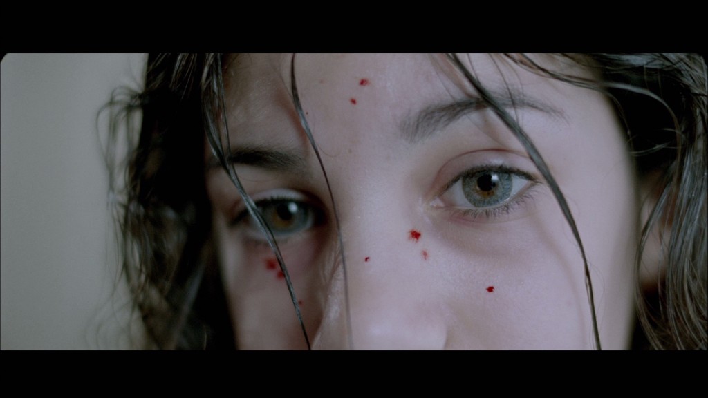
Let The Right One In
While I admit this cold, bleak, perpetual winter look is a cliche fall-back when you’re designing the look of a movie, when it’s done right it can be pretty spectacular. Some particular locations on this planet definitely improve with the high contrast, pure-black, desaturated look and the clinical feel that the grade can imbue sometimes makes thrillers and horror movies with an extra level of ‘squick’ that can make a viewer uncomfortable. This particular look can make human skin seem very pale and blood very black and when one contacts the other on-screen, there is a gruesome quality that can really be felt.
The International
Interestingly the value of human skin-tones can still shift by large degrees even if the rest of the image conforms to a particular style. Comparing the above two screenshots, the warmth or coldness of human skin colours definitely vary by quite a few degrees, but the established style in modern films is that sacrificing skin-tone integrity in the odd-scene is alright so long as it overall aesthetic of the film is strong. Because of this, you can see a surprising range of colour-information despite the fact that everything is greatly ‘greyed out’.
Clash Of The Titans (remake)
Of course beyond the standard thriller feel, sucking the colour out of a scene or film can imbue other qualities. Some people claim that a slightly desaturated image can make a desert feel hotter or a setting feel drier or more still or just make a story feel more intense. Subjectivity is everything in this artform and that’s why this is the second-most-popular fallback in colour-grades. If it feels familiar then don’t be surprised, this is the single most popular look for New Zealand films for almost the past few years. It’s also very popular with locally-produced high-end television commercials and short films. Perhaps New Zealanders think desaturated makes our environment feel less friendly and more…cinematic? Who knows? Personally I disagree and have a general distaste for this look for local productions, but then I’m not the one colouring them most of the time.
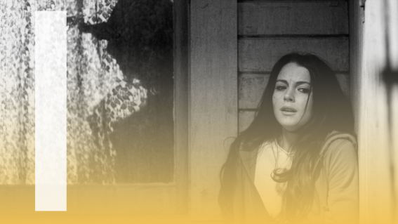
THE SODIUM LOOK
This is a cute and popular new look and one that’s creeping in lately, especially with the advent of digital photography where we have seen ‘stuff like this’ through our own experiences with home video cameras and reality-TV documentary shows. I call it the sodium look because of the strong bias towards the kind of colour values and sickly urine yellow wash and shadows you get under sodium-vapour streetlights (common in most First World countries).
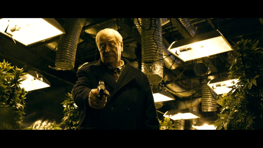
Harry Brown
This is very popular with British cinema at the moment and possibly owes a lot to the look seen in a lot of music videos and made popular by Guy Ritchie’s first two films Lock Stock & Two Smoking Barrels and Snatch. How intensely you’ll see it varies from film to film and often you’ll see it only used for night-sequences in films and have a different grading style applied to the day sequences. I’m not always consciously aware of why a certain film may pick this tone, but it is clear that it’s a particular look that is informed by and maybe an actual response to our modern way of life and our technology culture as a whole.
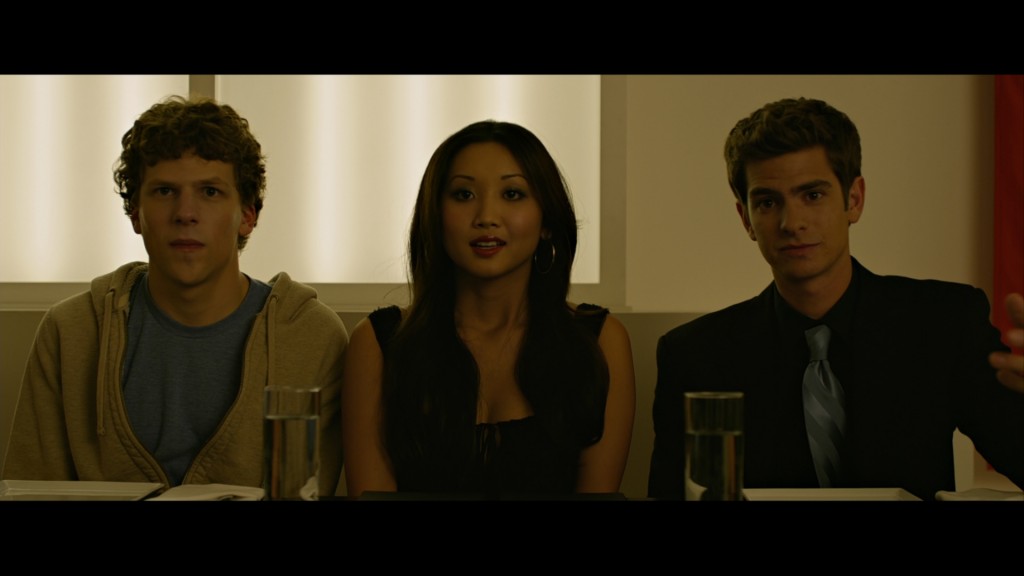
The Social Network
Of course it goes without saying that it can be very easy to go guano-loco with this look if you’re not careful. David Fincher’s The Social Network was a pretty in-your-face and unforgiving attempt to push the envelope on this look to the point where nobody really looks human anymore and the entire world of the film resembles a dirty, harsh and uninviting place that few would fear to tread. Come to think of it…maybe that isn’t over-the-top at all considering what the film was about?
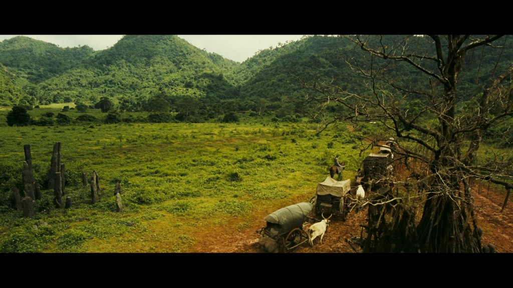
Ong Bak 2
Sometimes the look can turn up in some unusual places and films. The historical period martial arts epic Ong Bak 2 used the same dirty yellow colour-values for a surprising result: adding warmth and lush colour saturation to the jungles of Thailand and also accentuating the fire-lit night-scenes. Granted they go so overboard with the grade that, particularly with the tanned dark skin of the Thai actors, everyone looks like they need emergency vitamin C rations…but one would hope that audiences didn’t really notice this in favour of paying attention to the story and Tony Jaa’s propensity for beating the crap out of everyone on-screen.
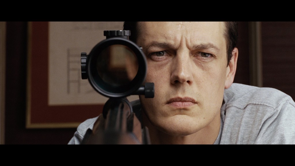
COLOUR IS A THEME
Now we’re inching into slightly braver territory and here’s a look that I’m actually kinda liking a lot at the moment. Okay, sure, if you wanted to be pedantic you could argue that this is really just a half-way point between the desaturated look and the orange/teal nightmare, but essentially how this works is tailoring how a film is coloured as a thematic expression. In short, rather than resorting to an established look, some films work hard to find a colour-scheme that really makes their film stand-out in a unique way.
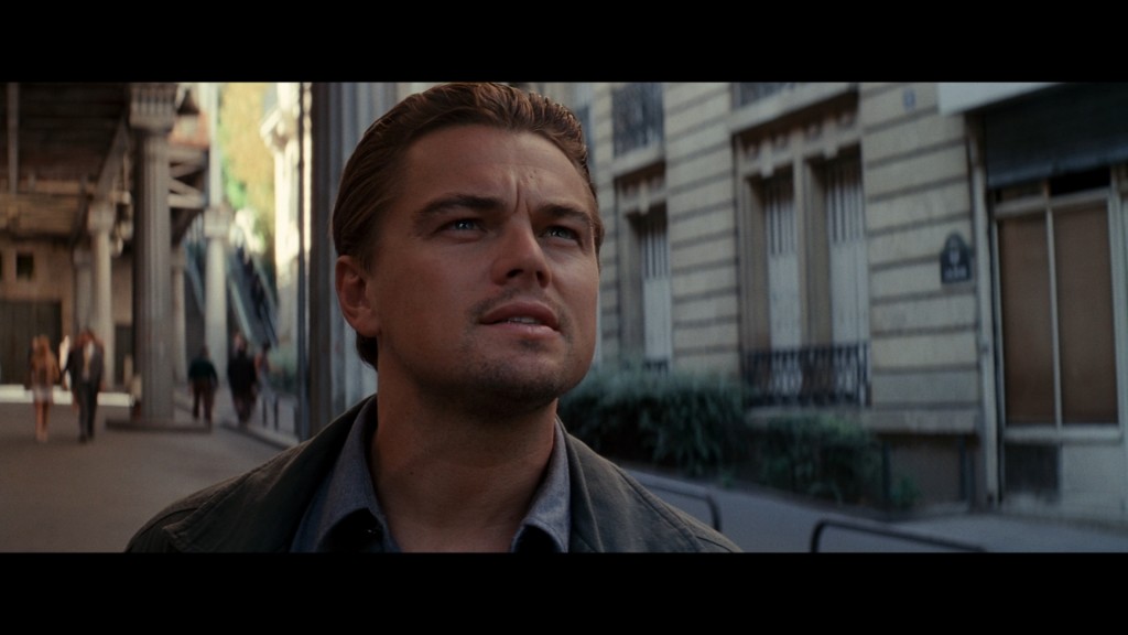
Inception
Often this involves very careful manipulation of the film’s imagery in coordination with the art design that was on-set as the film was photographed. Then certain colour-values are selectively sucked out while other values are enhanced (for instance in Chris Nolan’s fantastic Inception, golds and whites were the color-values of choice and were subsequently cranked up to 11 and featured heavily throughout the movie in thematic ways). This isn’t to suggest that other films don’t pay attention to colour-schemes, only that some films work hard to find their unique style that doesn’t evoke other films too much.
Point Blank
What I love about this particular aesthetic IS that the visuals are often built from the ground-up, taking into consideration not how the film is coloured during post-production, but also how things are photographed and constructed in front of the camera lens. Careful colour-control is a cinematographer’s trade and how much they exert over a film is determined by the story necessities: romantic comedies and balls-to-the-wall-testosterone-flicks may not necessarily need too much tweaking or design while fantasy, science-fiction, art-house and visually-committed dramas will play card stronger which will, ultimately, require more effort and time spent shooting the film as well as tweaking it in post-production.
Avatar
Sometimes films can be quite bold with this look simply by the simple visual decisions made. James Cameron’s Avatar certainly stuck a knife into the guts of the desaturated look and pushed for a more even and naturalistic look with special emphasis on blues, greens and yellows which became the thematic color-palette of the entire film.
BLEACHED THE FUCK OUT
This particular look harkens back to the days of 35mm film and photochemical development. While the name “bleach” refers to the bleach-bypass process which was a trend in the mid-1990’s, the stylized look actually goes back almost 60 years to the time of British cinematographer Oswald Morris and the 1956, John Huston-directed adaptation of Moby Dick. Morris was inspired by the maritime artform of scrimshaw: decorative, deep-black, illustrations on whale-bone and tusks executed by bored sailors during long sea voyages. Morris wanted an illustrative ‘scrimshaw-like’ look to the film and experimented with a variety of filters and lights to create a ‘black-and-white image superimposed over the color-image’ look for the film. This is, essentially, the aesthetic intent of the ‘bleached’ look.
SE7EN
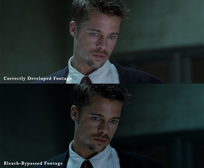
What Morris attempted back in 1956 was eventually perfected by celebrated director-of-photography Roger Deakins in the cinematic adaptation of George Orwell’s 1984 and then copied by music video and commercial filmmakers of the 1990’s. This was then ultimately made popular and a stalwart look for film and television in 1995 by director David Fincher and the mother-of-all-serial-killer-movies: Se7en. The look is realized by way of a photographic process known as ‘bleach bypass’. When 35mm film is developed at a lab, bleach is used to remove a layer of silver-nitrate that builds up on a film negative when it is processed through the emulsion. If, however, this process is skipped then silver-nitrate layer is retained and the resultant internegative that is created (which copies of the film is then made) has a perfect black-and-white copy of the image superimposed over the image itself. Fincher and his cinematographer Darius Khondji developed the look to give the film a gritty, rank and repulsive look which – based on the film’s enormous popularity – became copied by every horror and thriller filmmaker from that point onwards. Early experiments in digital bleach-bypass process (these days just called “bleach”…yes I know that doesn’t make any sense, bear with me) included Spielberg’s Saving Private Ryan where digital colour augmentation was used to amplify the effect which is predominant throughout the movie.
The Orphanage
The modern bleach look definitely has taken the delicately balanced feel of movies like Se7en and pushed it to the nth degree. Very similar to the cold, desaturated world, type of look; the bleach style is achieved usually through a wide array of plugins and software algorithms that simulate the effect and often give the colourist control over variables such as ‘film grain’ and blowing out the exposure. Most notably, the bleach look delivers deep, rich, oily blacks which add to the shadowy tone of an image and are always about pushing as much contrast as possible before the image starts to break up.
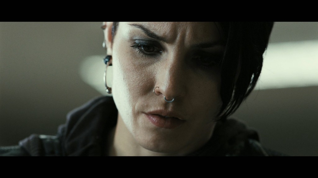
The Girl With The Dragon Tattoo
Simulated, digital, bleach-bypass is still a favourite among many music video and horror movie directors. Of course while it comes standard in most colouring suites and editing software, doing it correctly so that you can get a pristine, clean, but elegantly bleached out image is difficult and not something for amateurs to attempt for high-end product.
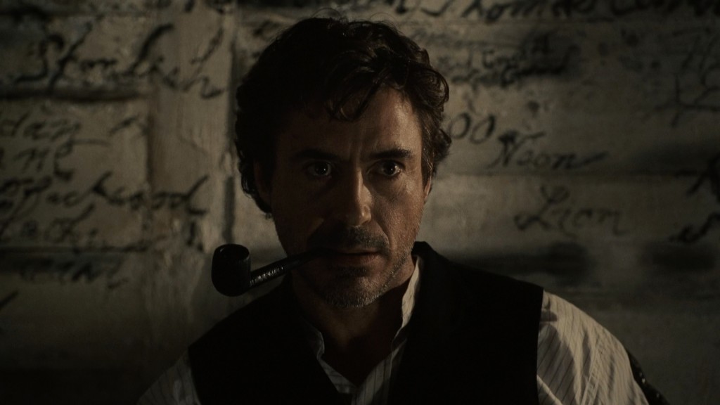
Sherlock Holmes
All being said and done, one should always pause and reflect that – like everything that is popular – a case of oversaturation is always on the horizon. I, for one, am growing pretty darn sick of this look and I’m hoping that filmmakers will attempt to think outside the box before reaching for the desat-wheel on their console.
PUSHED OFF THE CLIFF
If there is one particular visual look in film that I will put my hand up and cop the guilty-pleasure vice to, it is this. I love pretty pictures and I especially love ones that abandon restraint for possibility. It’s in this realm of design and style that truly beautiful imagery exists and where a movie may carve its own visual niche that rarely can be followed. In short, if you’re gonna push the look…then you might as well push it off the fucking cliff.
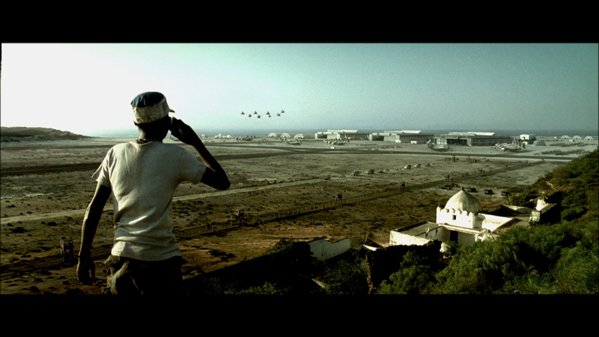
Black Hawk Down
Of course this goes almost without saying that many of the most visual filmmakers working today will always go off the edge of the cliff because it is in their nature to push visuals rather than rely on time-and-tried methods. Film is a visual medium and with the tools now available to make the visuals very interesting, it’s the movies which exploit these tools for all they’re worth that stick the most in my memory.
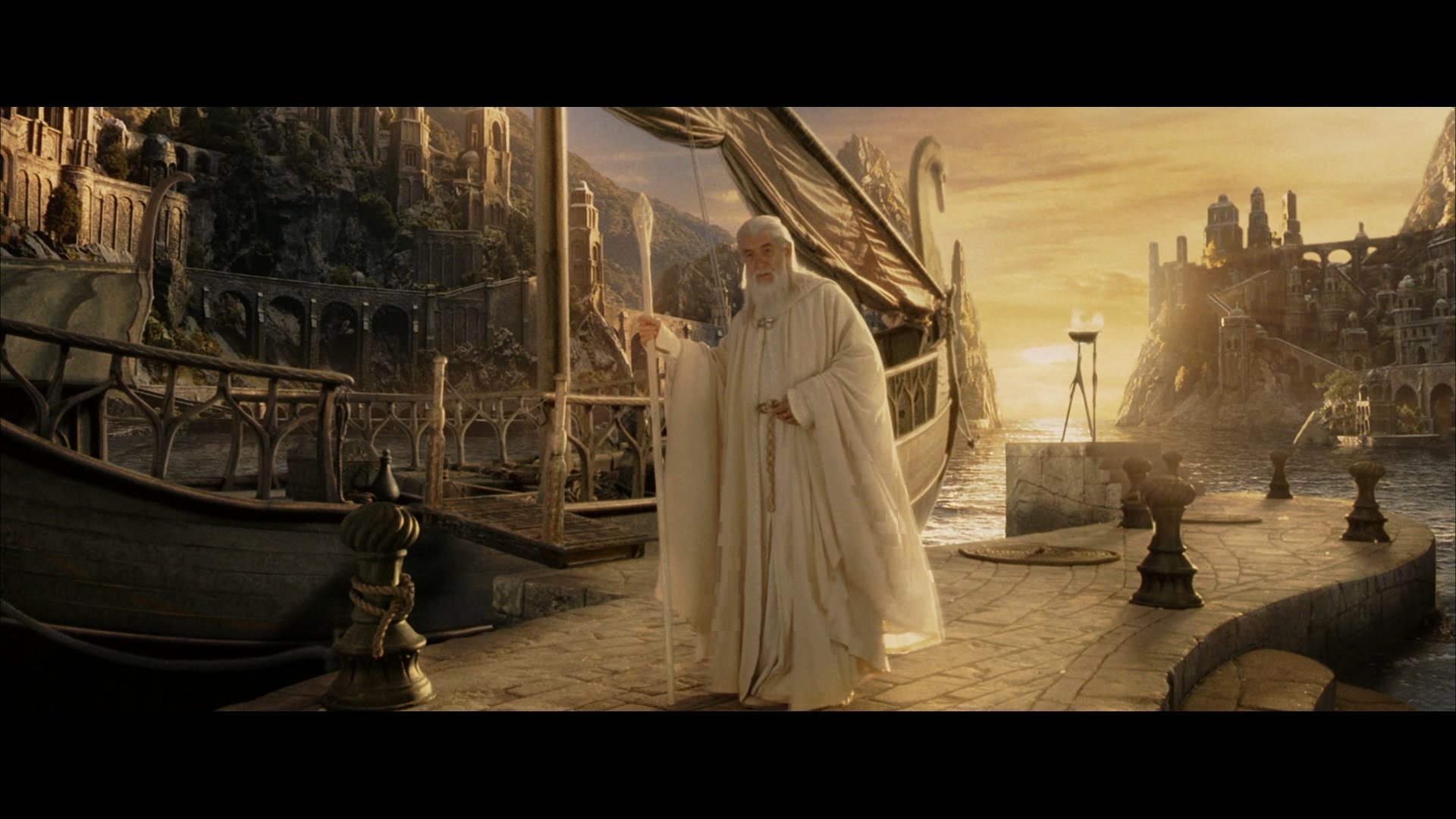
The Lord Of The Rings: The Return Of The King
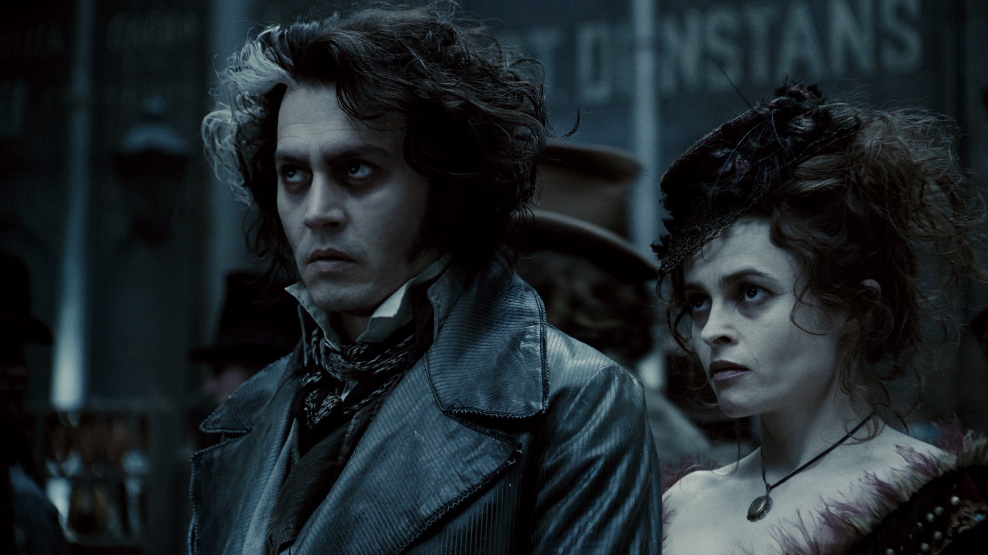
Sweeney Todd: The Demon Barber Of Fleet Street
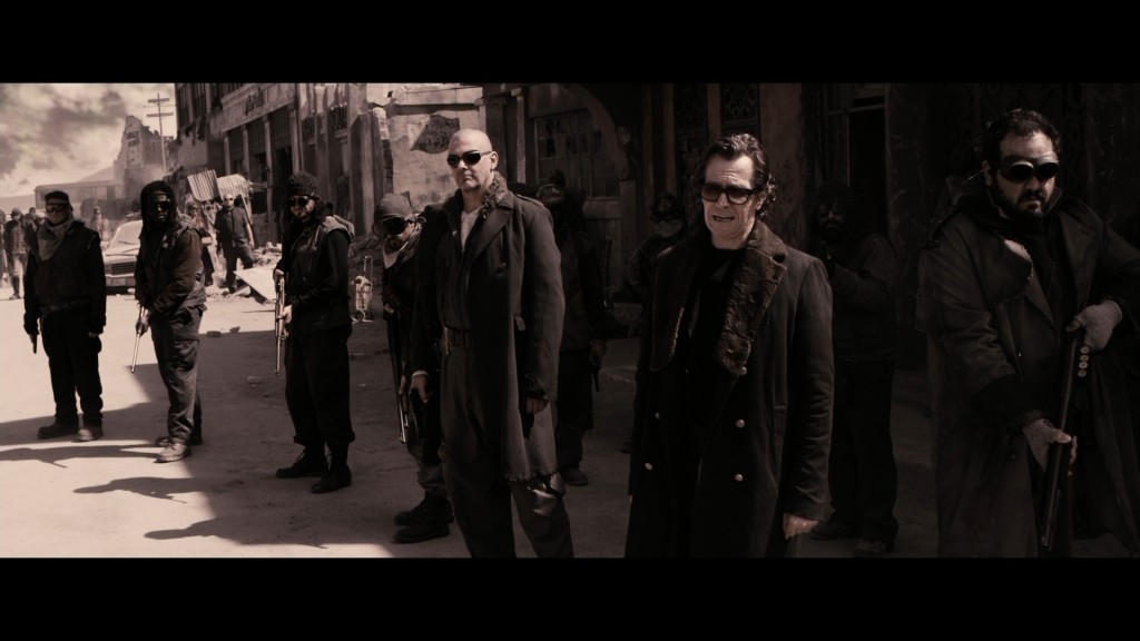
The Book Of Eli
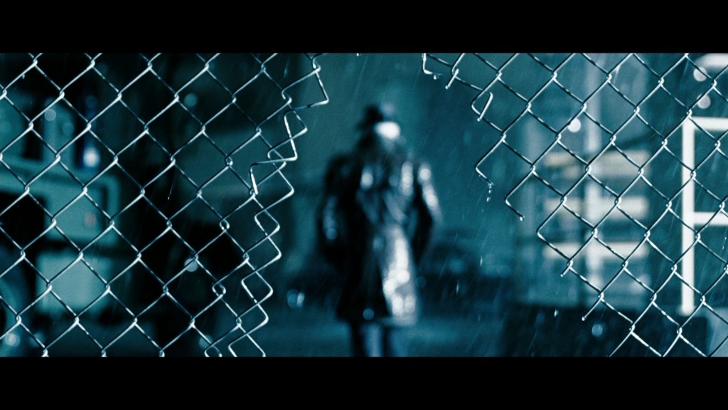
Watchmen
At the end of the day, fortune may not always favour the brave…but it sure makes keeps things from getting boring. When in doubt, I’m always impressed with films that dare to go that step further rather than stick to hum-drum safe and sound.
COLOUR: THE NEW BLACK
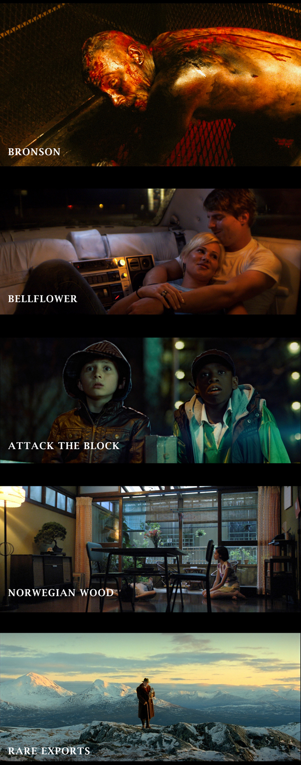
Ohhhhh thank you thank you thank you thank you! Finally, after almost a decade of sucking the colour and life out of film and television, modern independent cinema is making colour cool again. Most notable in recent memory is, arguably, the year’s greatest movie: Drive with its super-saturated, beautifully rendered, colour-palette, deep washes of contrasting lighting and bold propensity to crank up the visuals by making them a feast for the cones in your eyes and not just the rods.
Colour is back baby and it’s awesome! Leave it to the indies to knock down the doors and take some names! And what’s surprising is how rich, deep, beautiful and dreamlike colour can be in modern film shot on today’s gear and graded on the digital platform. Moody, poignant, powerful, creating shapes not just through the difference of light and shadow, but in the difference of shade and tone. If you want to know what Hollywood films will look like five years from now, this is pretty much it by my reckoning:
And that brings us to the end of this brief and somewhat shallow tiki-tour of how and why films look the way they do. Of course we shouldn’t forget that colour-correction is merely just that: correction. Without the beautifully photographed images, painstakingly recorded by teams of lighting designers, camera-operators and the cinematographer whose visual vision is always at the heart of each shot, there would be nothing to grade and ergo nothing to see.
I hope that this short stroll hasn’t ruined films for you because I CAN guarantee that some of you will not be able to stop seeing these various styles and looks at the movies from now on. Hopefully the inverse may occur: that you have achieved a greater appreciation for how films come to be, given what filmmakers have to work with and the technology that they wield to achieve those results. That is the point of this blog and that is the appreciation of the art of film beyond the mere contents the medium delivers.
Thanks for reading!